Graphic designers use the word layout to refer to the placement and position of many objects which add up to create one design or spread. If you are viewing a magazine, brochure or website that has been laid out well, you won’t even notice, because the pages will be easy to read, pleasing to the eye, and interesting.
However, if you’re looking at a page spread that has been laid out poorly, you may get frustrated, confused or become uninterested.
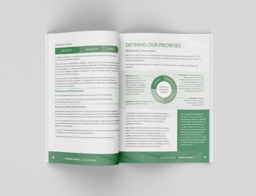
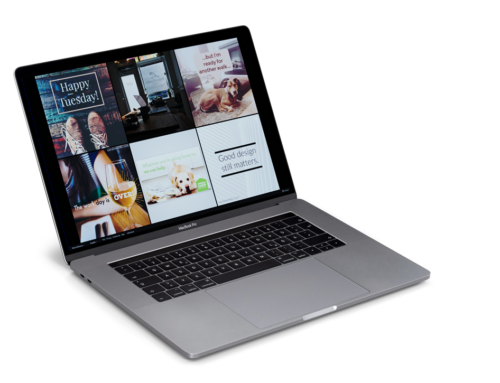
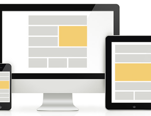
Layout consists of images, text headings, text body, and white space. It can also include charts, breakout text and anything else a client decides to throw in there. It is the graphic designer’s job to take all of the elements given to them by a client, and lay them out in a neat, organized and engaging fashion, while maintaining the integrity of the content.
When elements such as images and text in a layout line up with eachother, they create something called eyelines. Eyelines allow for clarity, are aesthetically pleasing, and lead a viewer’s eye across a spread, creating what designers call movement. Movement gives a sense of unity across all of the pages in a spread, and allows the reader to effortlessly take in the information in the intended order, without thinking twice about it.
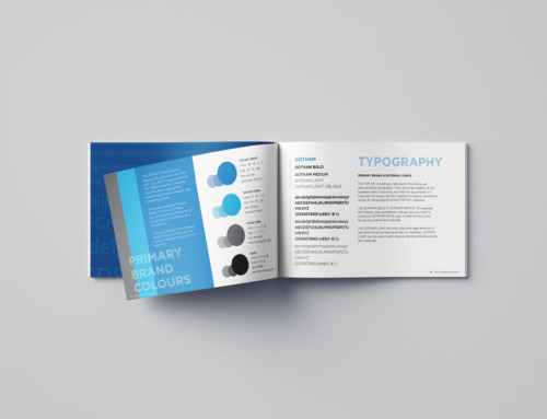
As always, choosing the right fonts plays a big role in successful layout design. I like to use typefaces that have a large family, such as Helvetica Neue or Myriad Pro. This allows me to use bold and light versions of each font. (Both Helvetica and Myriad also have extra light and extra bold versions as well, which really come in handy.) It’s best to stay away from fonts such as Comic Sans, Papyrus, and any others that have a stigma attached to them. Display fonts such as Scriptina should only be used in headings, and often have to be re-spaced.
Contrast is a fundamental principle in typography. It can be achieved in a number of ways, like font size, weight and proportion. Having contrast in your font choices often means using two or more typefaces. As a general rule of thumb, I usually do not use more than two fonts. A spread that has too many causes them to compete, loses it’s focus and becomes difficult to navigate.
Both header and body fonts should be easily readable, and appropriate for their application. For instance, a script font such as Zapfino may be appropriate for the heading of an article about weddings, fashion or gardening. However, it may not appropriate to use such a whimsical font for a heading about something serious, like AIDS or poverty. And it should never, ever be used in a body of text.
White space is, quite literally, the space on a page that is not filled by any objects or type. There are varying levels of white space, from the space between the characters of a typeface to the size of the margins in a layout. You many not realize it but the human eye is constantly measuring the distance between things, and finding objects that are unevenly spaced. This came in handy eons ago, during our hunting and gathering days, and it still matters!
A lot of white space can be used to create a clean look, whereas very little can be intentionally chaotic, or unintentionally cramped. An ample amount of white space allows your type and images to breathe. Too much of it causes an awkward emptiness, the appearance of a lack of content, and poor eyelines.
Ultimately, it’s the human eye and brain that decide whether a page spread is laid out well or not, and that decision is based on three things.
1. The brain has been taught to read from left to right. (Yes there are exceptions to this in certain parts of the world)
2. It has been ingrained in us to place importance on larger elements, and look at them first.
3. We have a general affinity towards symmetry and things that line up, and we find that aesthetically pleasing.
So, it is very important for a graphic designer to look away from their work for a period of time, and forget about it. I usually set something aside for a day or two before sending it off to a client, so that I can put a fresh set of eyes on it before anyone else critiques it. Often I’ll tweak a few things.
The biggest thing to keep in mind when designing a spread layout, is that your brain doesn’t lie. I’ve scrapped many an idea because, while it worked in theory, it just didn’t come out looking the way I wanted, or it was just too busy. Clarity and readability take precedence over style and design.
Leave A Comment