Project Description

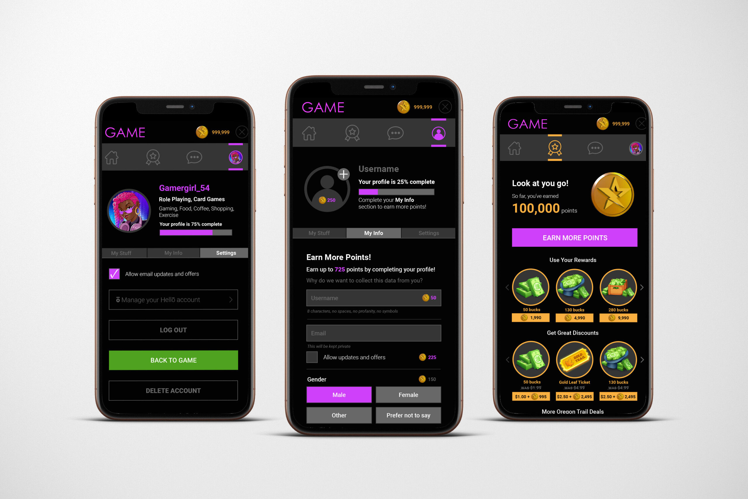
This user interface was created for a mobile gaming rewards program, designed to motivate players, simplify earning actions, and make the redemption experience feel exciting and intuitive. The visual direction blends gaming aesthetics with modern app design, creating an environment that feels both playful and trustworthy.
Establishing a Reward-Forward Experience
Because the primary purpose of this interface is to help players earn and redeem points, the design emphasizes progress, value, and immediacy. Large point totals, bold reward icons, and high-contrast call-to-action buttons create a sense of momentum and achievement. Gold, the symbolic color of currency and success, is used throughout to reinforce the reward-driven nature of the platform.
Clear Visual Hierarchy
To support quick decision-making, the layout uses a strong visual hierarchy:
-
Dark backgrounds provide a neutral canvas that allows buttons, badges, and point values to stand out.
-
Bright accent colors—gold, purple, and orange—direct attention to important actions and milestones.
-
Modular card layouts break information into manageable sections, making it easy for users to browse rewards, track progress, and update their profile without feeling overwhelmed.
This structure ensures players can navigate effortlessly, even within information-heavy screens.
Consistent, Game-Inspired Iconography
Iconography plays a major role in guiding navigation and reinforcing the theme. Circular icons and illustrated reward items give the interface a friendly, cohesive visual language. The iconic gold coin motif acts as an anchor across the experience, immediately signaling value and continuity from screen to screen.
Balancing Energy and Usability
The design balances a rich, energetic atmosphere with the clarity needed for everyday use. While the color palette is vibrant and the illustrations are dynamic, the underlying layout remains clean and predictable. Typography is simple and legible, with large numbers and clear labels to support fast scanning and reduce cognitive load—important considerations for users who may be multitasking while gaming.
Guiding Users Toward Completion
Progressive disclosure is used strategically throughout the interface. Users see just enough information to take the next step—redeem a prize, complete a task, update their profile—but are never overwhelmed by unnecessary detail. This approach supports sustained engagement by making progress feel achievable and immediate.
A Cohesive Ecosystem
From onboarding through reward redemption, every screen is designed to feel connected and purposeful. Consistent navigation, repeated visual motifs, and clear pathways keep users grounded while reinforcing brand identity.
