Project Description
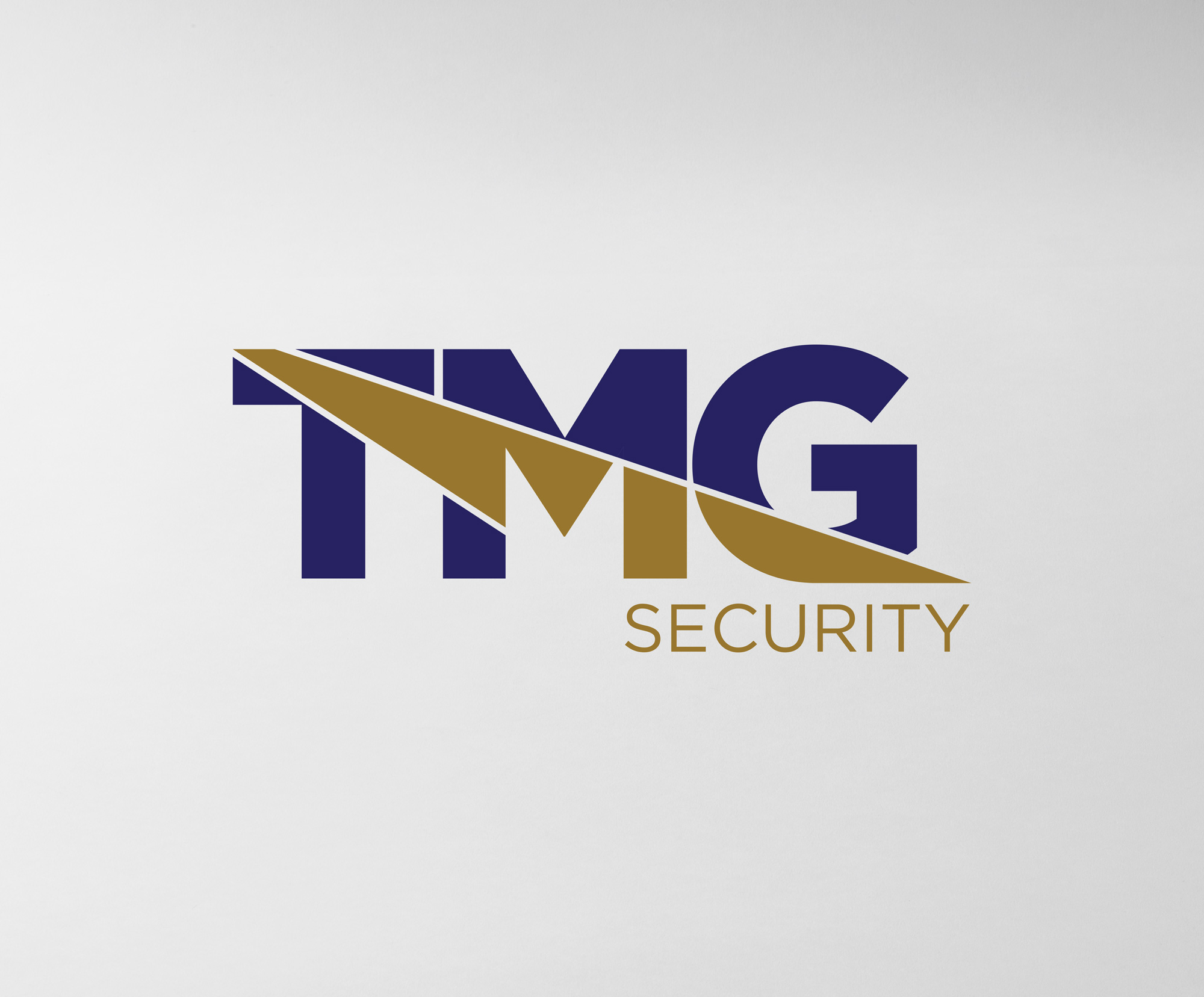
This logo was created to represent a professional, modern security company with a strong and trustworthy presence. The design uses bold, geometric lettering to establish confidence and stability, while the sharp diagonal graphic adds a sense of motion, alertness, and precision. The split through the “TMG” creates a dynamic visual rhythm that conveys vigilance and forward momentum, which are key qualities for a security-focused brand.
The colour palette pairs deep navy with metallic gold to communicate reliability, authority, and premium service. Navy reinforces professionalism and safety, while gold introduces a high-end feel and distinguishes the brand within an industry often dominated by neutral tones. The clean sans-serif typography used for the word “Security” balances the strength of the main mark, ensuring clarity and readability at all sizes.
The result is a distinctive, confident identity that positions TMG Security as a dependable and upscale provider in the security sector.

