
Project Description
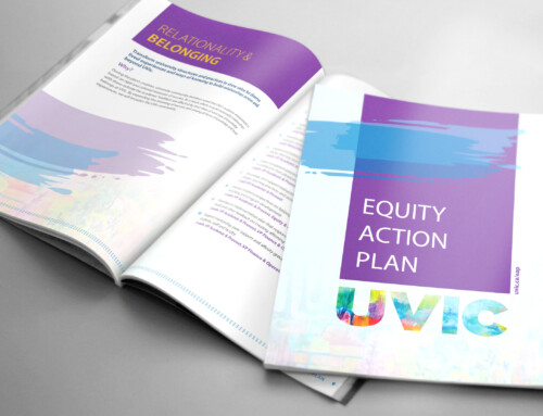
Strategic Use of Color Blocking
I use colour intentionally to create structure and make information easier to navigate. In this report, the bold color blocks help anchor each section and add energy without distracting from the content. They guide the eye naturally, making the layout feel organized and confident.
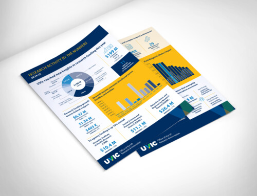
Clear, Modern Data Visualization
Charts and graphics are designed to be clean, simple, and easy to understand at a glance. By keeping the visuals streamlined and using a consistent colour palette, I can present complex information in a way that feels approachable and supports the story the data is telling.
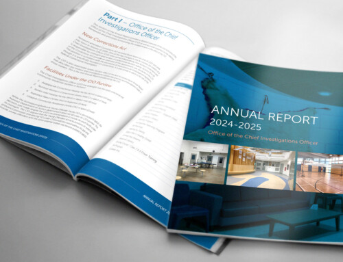
Thoughtful Hierarchy and Layout
Every page is built around clarity. I use spacing, column structure, and typographic hierarchy to make dense information feel readable and well-balanced. The mix of text, imagery, and graphics creates a smooth flow that helps readers move through the report without feeling overwhelmed.
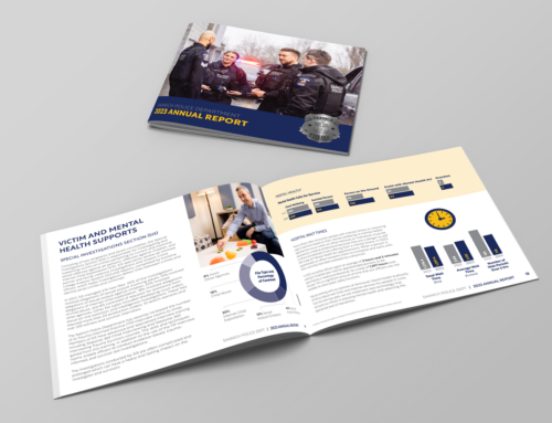
A Cohesive and Professional Tone
The overall design reflects the credibility and professionalism of the program while still feeling warm and human. Photography, colour, and typography work together to create a consistent visual tone that feels polished, trustworthy, and aligned with the organization’s identity.