Project Description
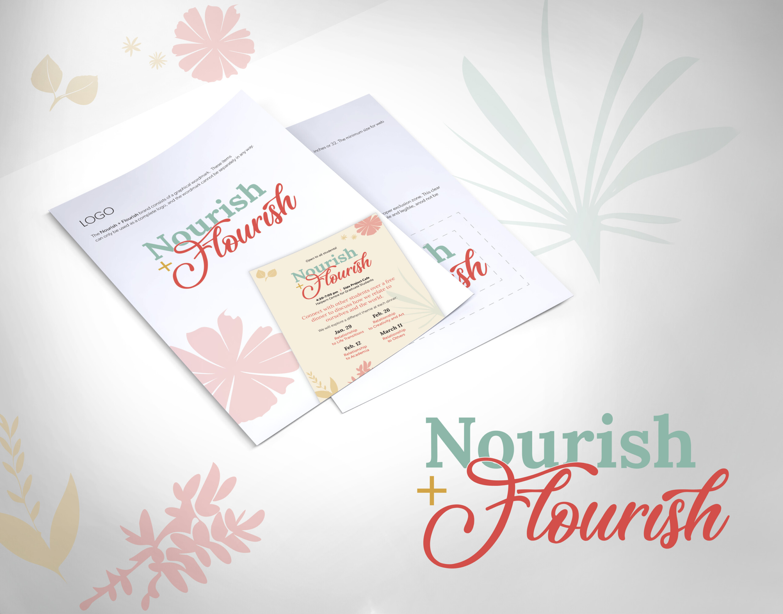
The Nourish + Flourish logo has a warm, inviting, and uplifting feel, built around a combination of elegant typography and soft, nature-inspired visuals.
Typography
-
The word “Nourish” is set in a soft, muted green serif font. It feels calm, grounded, and nurturing.
-
The word “Flourish” uses a contrasting script font in a warm coral-red color. Its flowing, calligraphic style adds energy, movement, and a sense of growth.
-
The “+” between the two words is simple and clean, acting as a visual connector.
Color Palette
-
Muted green evokes health, calm, and natural living.
-
Coral-red brings warmth, creativity, and vibrancy.
-
Supporting visuals use soft beige and pastel pinks, reinforcing a gentle, botanical aesthetic.
Imagery & Style
-
The design incorporates floral and leaf illustrations in the background and around the layout.
These elements are light, airy, and understated, helping reinforce the themes of growth, nourishment, and nature. -
The overall style is fresh, feminine, and organic, with a modern wellness-focused tone.
Overall Impression
The logo blends stability + vitality: the serif type provides structure, while the script brings liveliness and personal warmth. The botanical accents make it feel holistic and nurturing, which is ideal for a brand centred around wellness, lifestyle, or community-focused programs.
