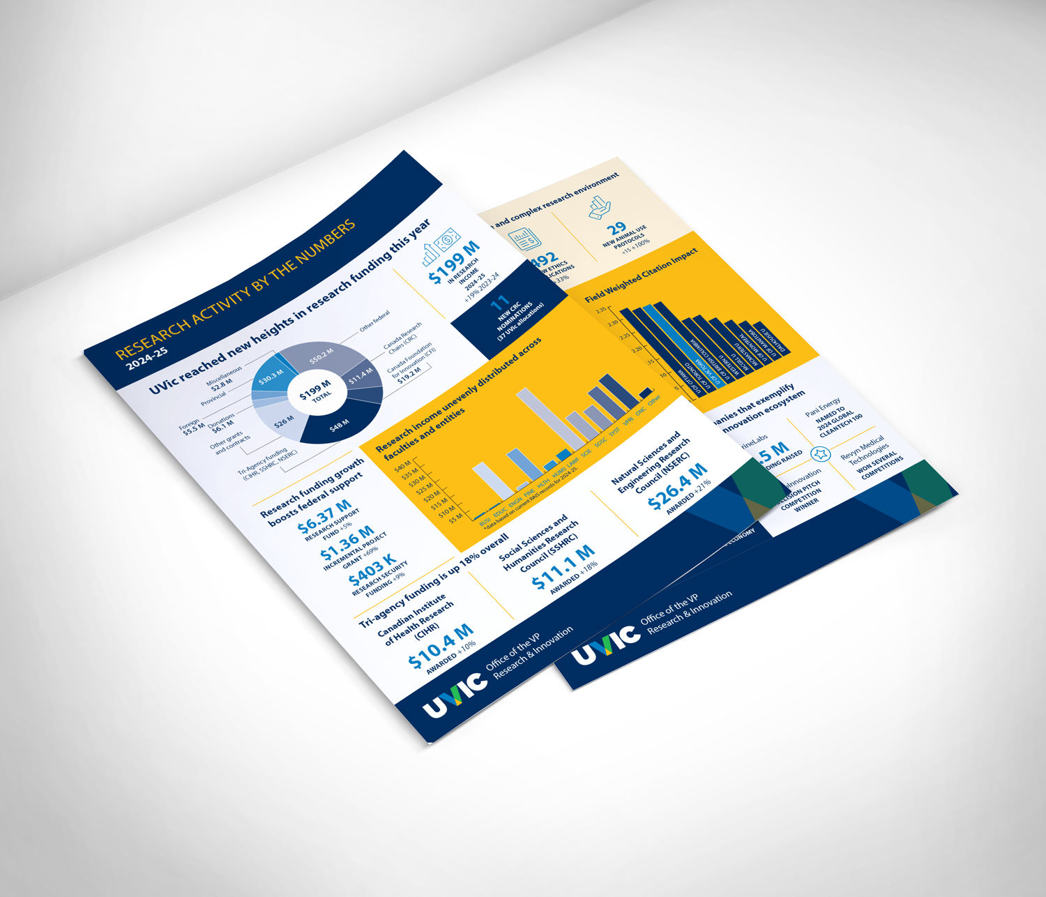
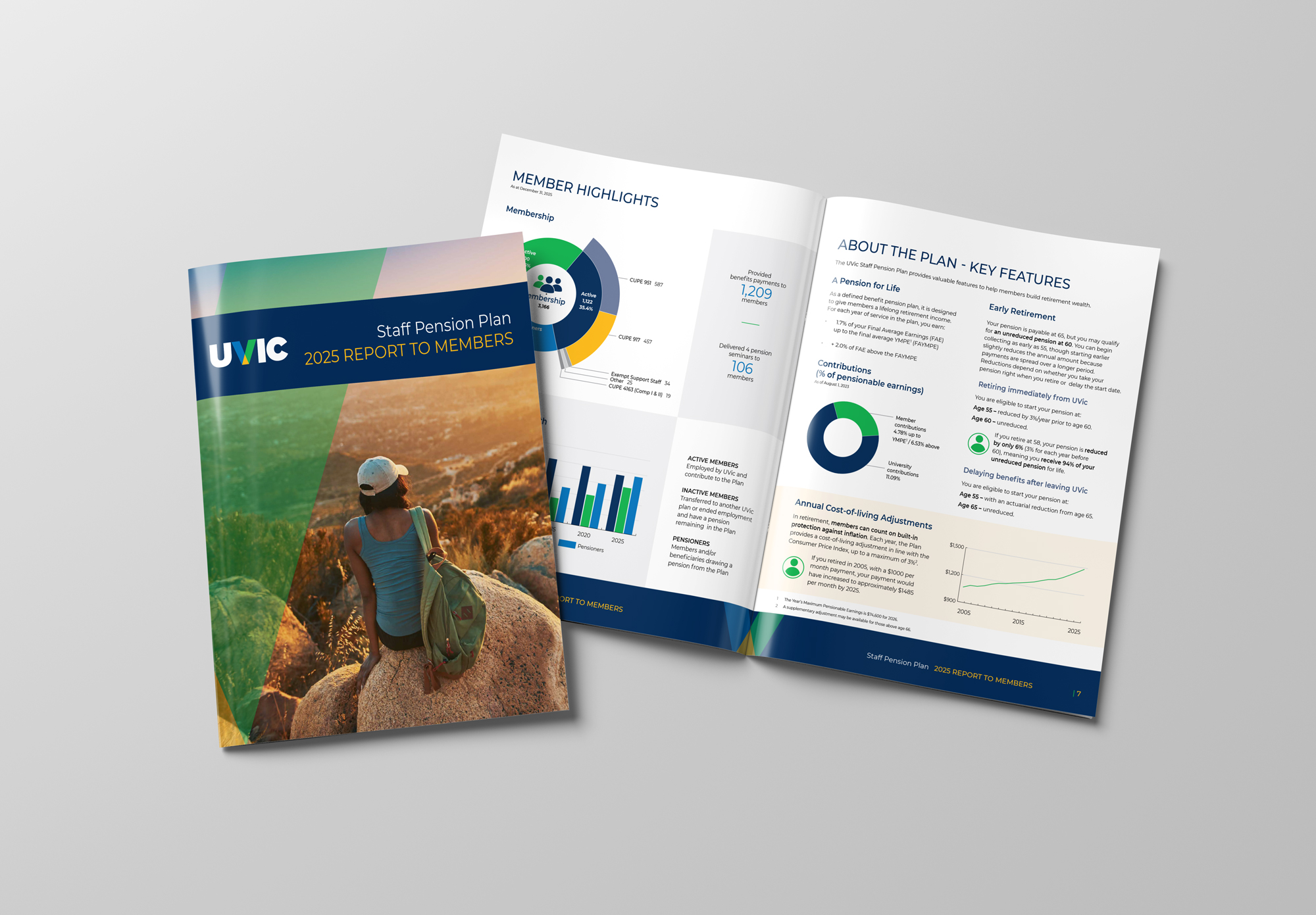
Layout and design of UVIC's 2025 Pension Plan reports, these reports include visualizing data, designing infographics, text layout and image inclusion.
Sasquatch Home Services
For Sasquatch Home Services, I created a brand identity rooted in local character and environmental values. The logo and visual system capture a balance of “home comfort plus respect for nature,” helping the company position itself as friendly, trustworthy, and community-minded. By using a mascot-style logo and nature-inspired graphics rather than a typical “sterile
Pacificanna
I created a clean, modern brand identity for Pacificanna that reflects the company’s focus on education, accessibility, and a welcoming retail experience. The visual system combines coastal-inspired elements with a contemporary aesthetic, giving the brand a calm, polished look that stands out in a crowded cannabis market. Clear typography, friendly colour palettes, and versatile
Pirate Pizza
Pirate Pizza Co. is a waterfront pizzeria located at Fisherman’s Wharf in Victoria, known for its relaxed atmosphere and West Coast take on New York–style pizza. I created a cohesive visual identity for the business that included the logo, menus, and all exterior and interior signage. The design draws from the restaurant’s nautical setting
The Land Conservancy of British Columbia (TLC)
This logo was developed to reflect The Land Conservancy of BC’s mission to protect, restore, and steward natural landscapes across the province. The design combines a stylised coastal tree rooted into bedrock with a mallard in flight, symbolising both ecological resilience and the freedom that protected environments provide. The inclusion of the mallard is
Mushroom Envy
The Mushroom Envy branding leans into natural, clean, ethical beauty, with focus on plant-based ingredients, cruelty-free standards, and gentle skincare. The design reflects that with a look and feel that balances earthy authenticity, wellness-friendly softness, and modern e-commerce polish. I designed the Mushroom Envy logo to reflect the brand’s focus on natural, plant-based skincare.
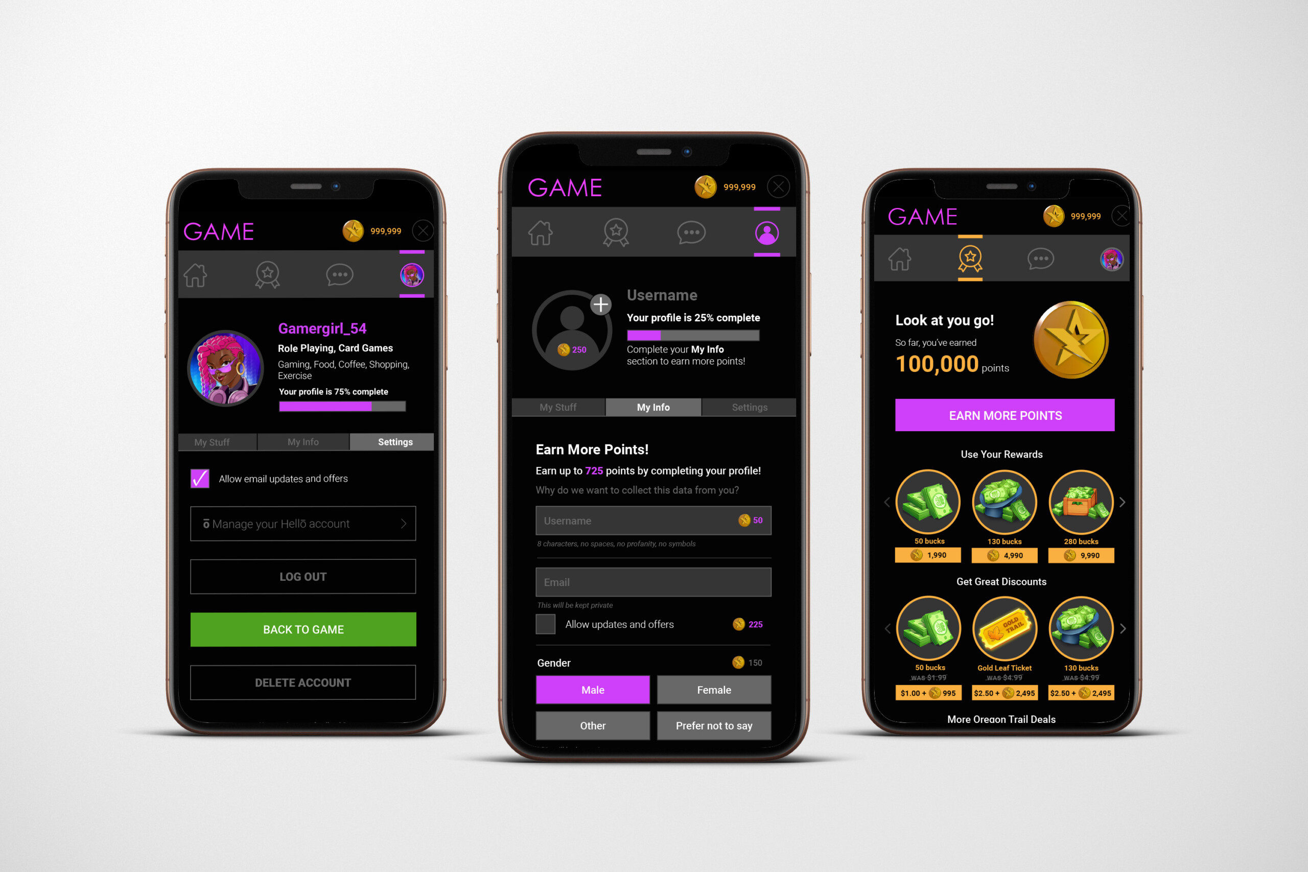
GAME UX/UI
This user interface was created for a mobile gaming rewards program, designed to motivate players, simplify earning actions, and make the redemption experience feel exciting and intuitive. The visual direction blends gaming aesthetics with modern app design, creating an environment that feels both playful and trustworthy. Establishing a Reward-Forward Experience Because the primary purpose
UVIC – Nourish + Flourish
The Nourish + Flourish logo has a warm, inviting, and uplifting feel, built around a combination of elegant typography and soft, nature-inspired visuals. Typography The word “Nourish” is set in a soft, muted green serif font. It feels calm, grounded, and nurturing. The word “Flourish” uses a contrasting script font in a warm coral-red color.