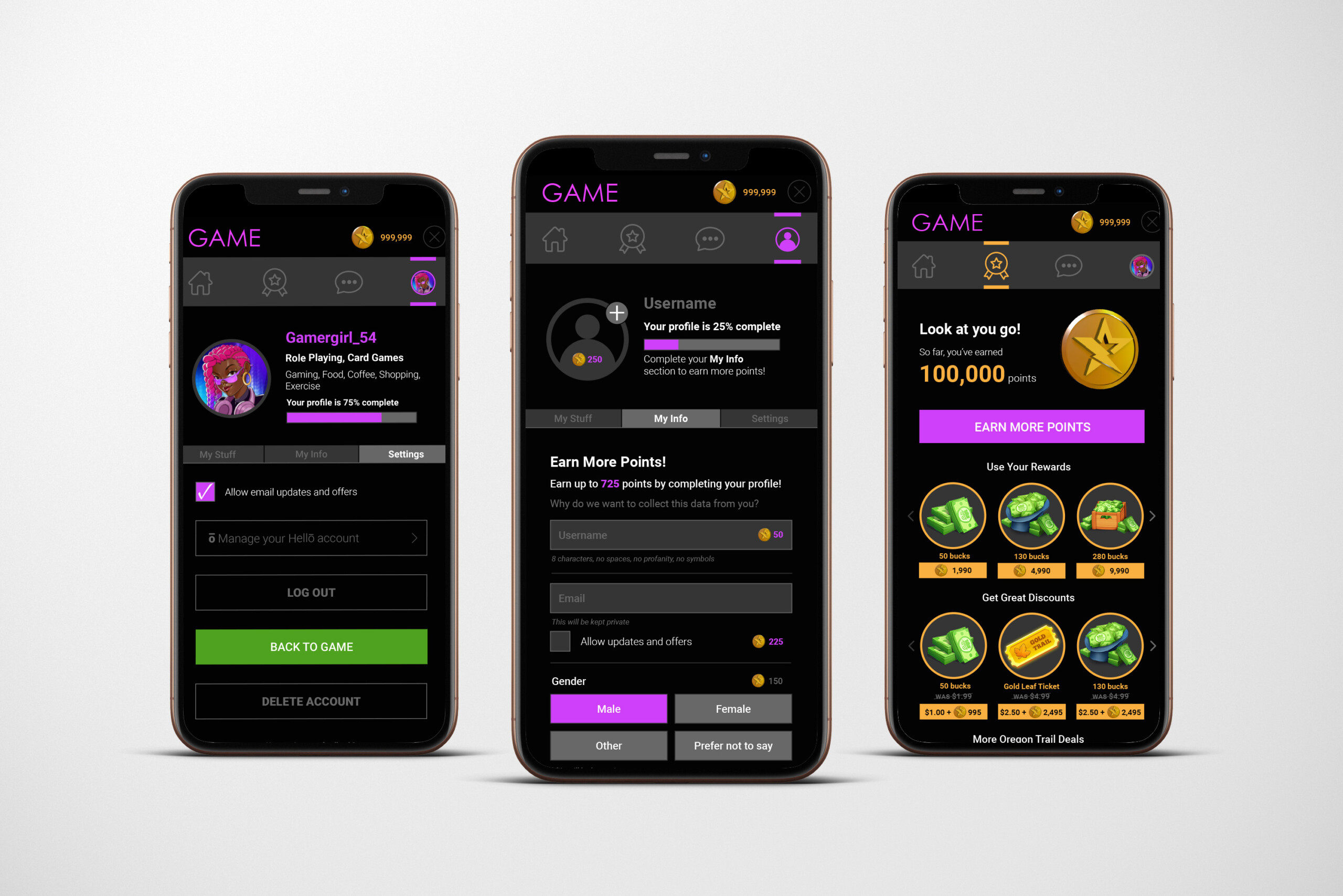
This user interface was created for a mobile gaming rewards program, designed to motivate players, simplify earning actions, and make the redemption experience feel exciting and intuitive. The visual direction blends gaming aesthetics with modern app design, creating an environment that feels both playful and trustworthy. Establishing a Reward-Forward Experience Because the primary purpose

UVIC – Gustavson School of Business
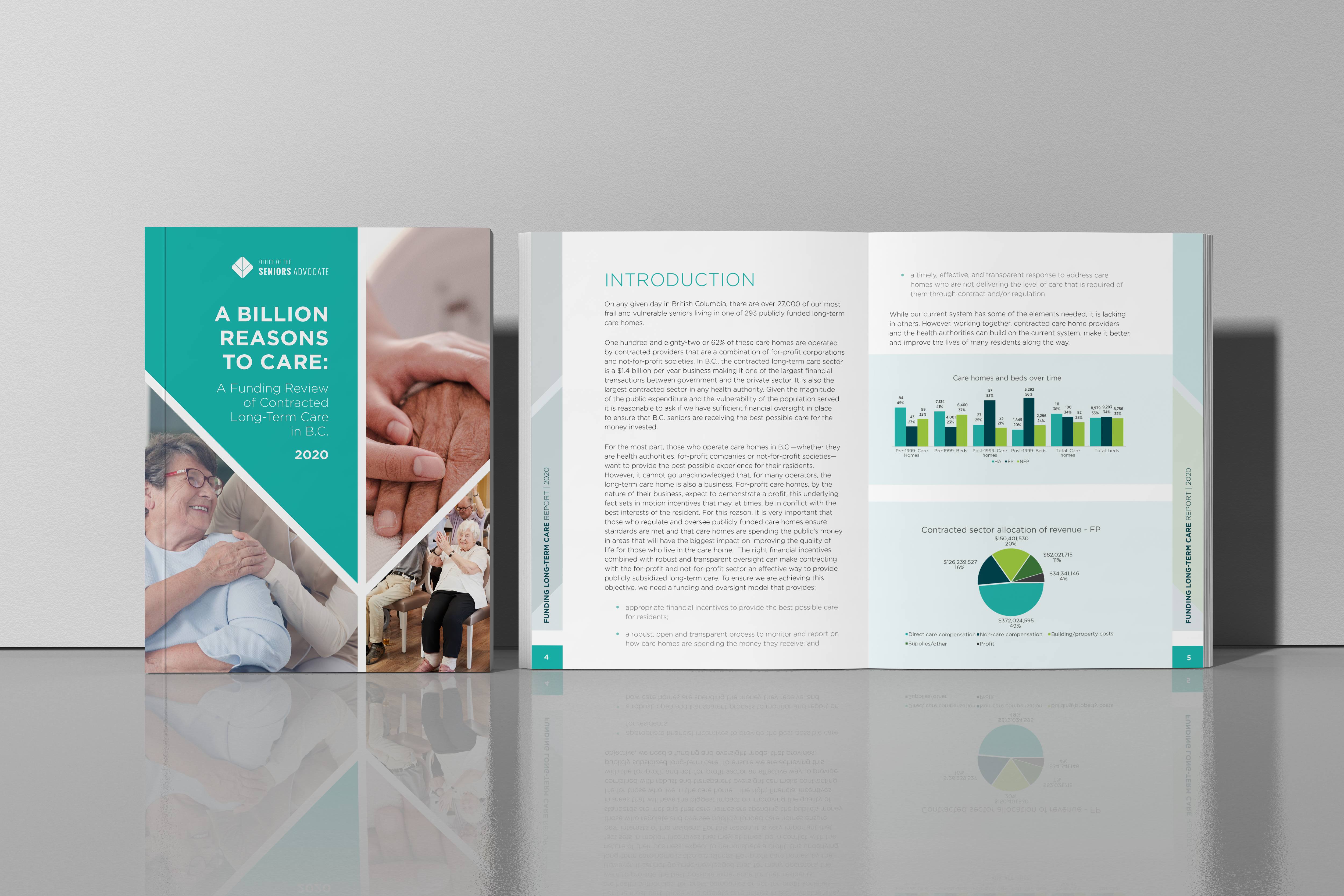
Strategic Use of Color Blocking I use colour intentionally to create structure and make information easier to navigate. In this report, the bold color blocks help anchor each section and add energy without distracting from the content. They guide the eye naturally, making the layout feel organized and confident. Clear, Modern Data
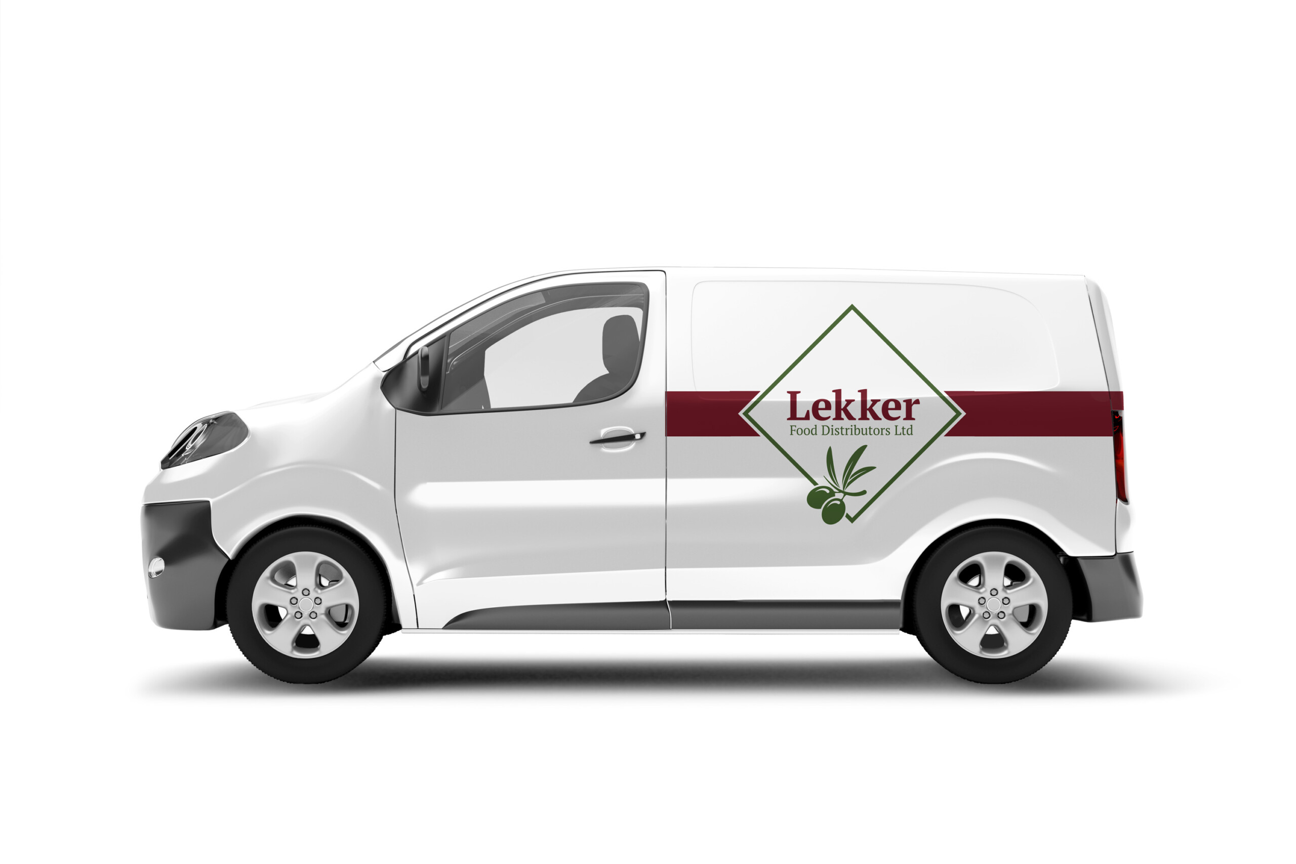
Sasquatch Home Services
For Sasquatch Home Services, I created a brand identity rooted in local character and environmental values. The logo and visual system capture a balance of “home comfort plus respect for nature,” helping the company position itself as friendly, trustworthy, and community-minded. By using a mascot-style logo and nature-inspired graphics rather than a typical “sterile

Office of the Chief Investigations Officer, Nunavut
This is a 60‑page annual report designed for print and web, featuring a well-structured layout integrating text, images, tables and charts. The design delivers clarity and professionalism across complex content, ensuring the report is visually balanced and readable while supporting accessibility for diverse audiences.
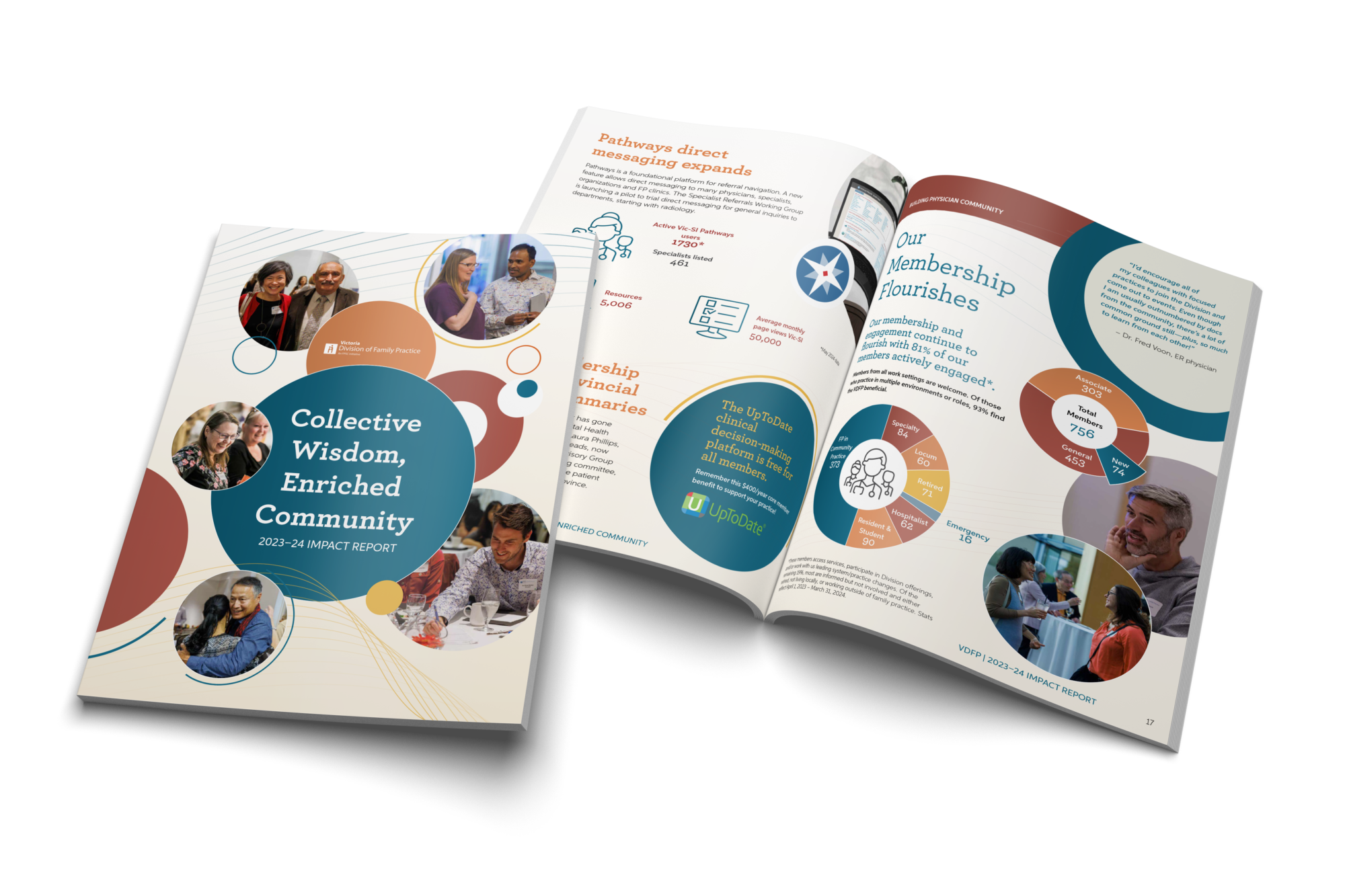
Victoria Division of Family Practice
I designed this professionally produced impact report with a clean, friendly, community-focused visual identity.The design uses a modern, warm, community-centric visual language. It feels approachable and human, while still polished and organizational. The aesthetic blends:Rounded, organic shapesSoft, warm colour paletteBalanced mix of photography and vector graphicsClean, readable typographyThis creates a tone of trust, collaboration, and
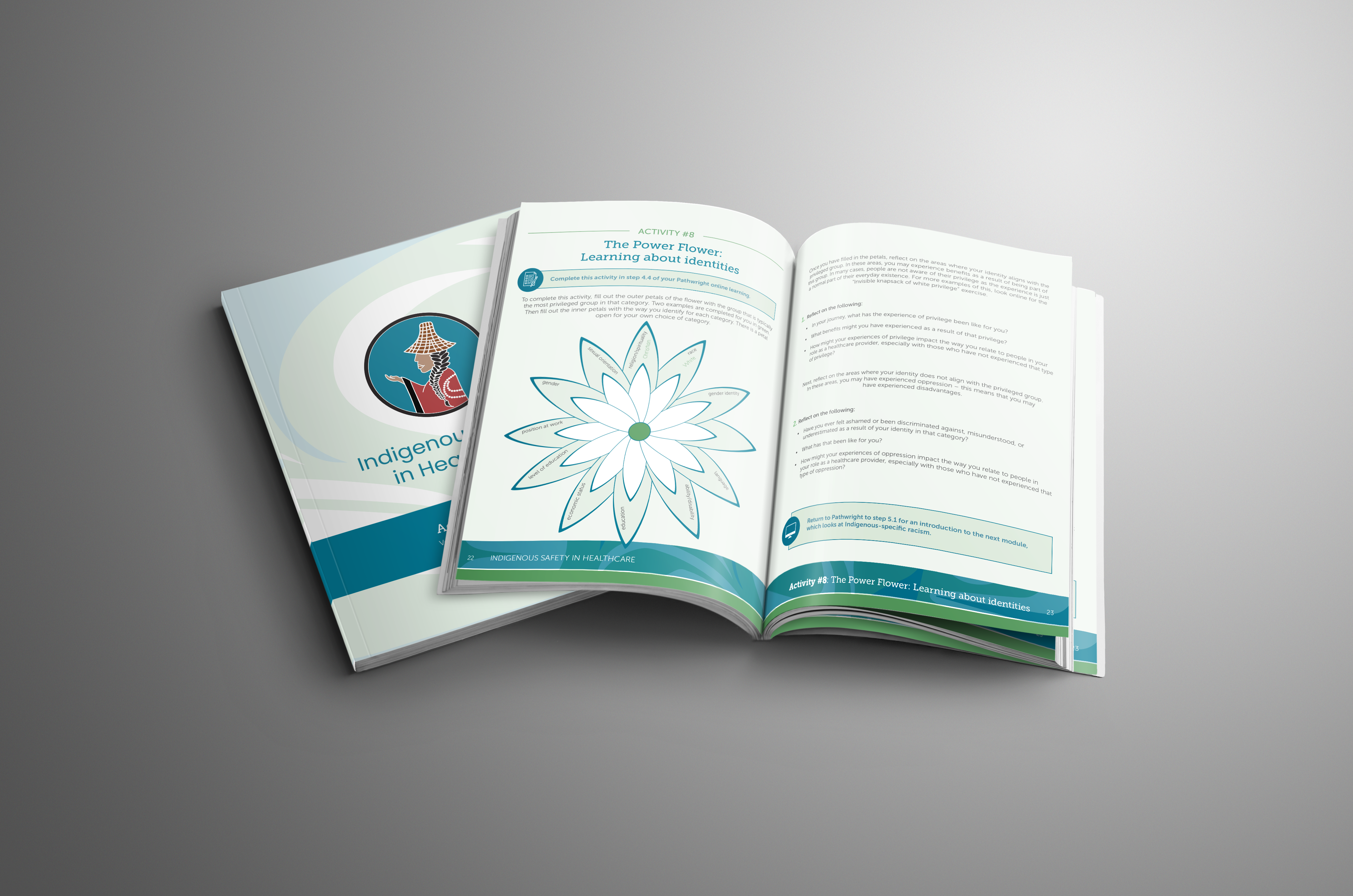
Victoria Native Friendship Centre
Layout and design of the Victoria Native Friendship Centre's Indigenous Healthcare and Safety course training material. Please note that all artwork was designed by an indigenous artist and digitized by me with their permission.
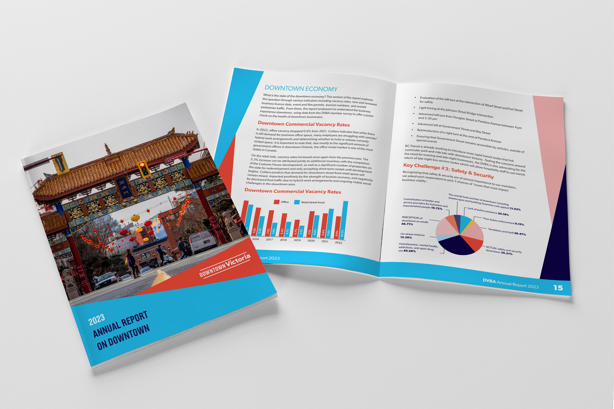
the DVBA
Print-layout document design for the Downtown Victoria Business Association''s 2023 Annual Report.