Pirate Pizza Co. is a waterfront pizzeria located at Fisherman’s Wharf in Victoria, known for its relaxed atmosphere and West Coast take on New York–style pizza. I created a cohesive visual identity for the business that included the logo, menus, and all exterior and interior signage. The design draws from the restaurant’s nautical setting
The Land Conservancy of British Columbia (TLC)
This logo was developed to reflect The Land Conservancy of BC’s mission to protect, restore, and steward natural landscapes across the province. The design combines a stylised coastal tree rooted into bedrock with a mallard in flight, symbolising both ecological resilience and the freedom that protected environments provide. The inclusion of the mallard is
UVIC – Nourish + Flourish
The Nourish + Flourish logo has a warm, inviting, and uplifting feel, built around a combination of elegant typography and soft, nature-inspired visuals. Typography The word “Nourish” is set in a soft, muted green serif font. It feels calm, grounded, and nurturing. The word “Flourish” uses a contrasting script font in a warm coral-red color.
Sasquatch Home Services
For Sasquatch Home Services, I created a brand identity rooted in local character and environmental values. The logo and visual system capture a balance of “home comfort plus respect for nature,” helping the company position itself as friendly, trustworthy, and community-minded. By using a mascot-style logo and nature-inspired graphics rather than a typical “sterile
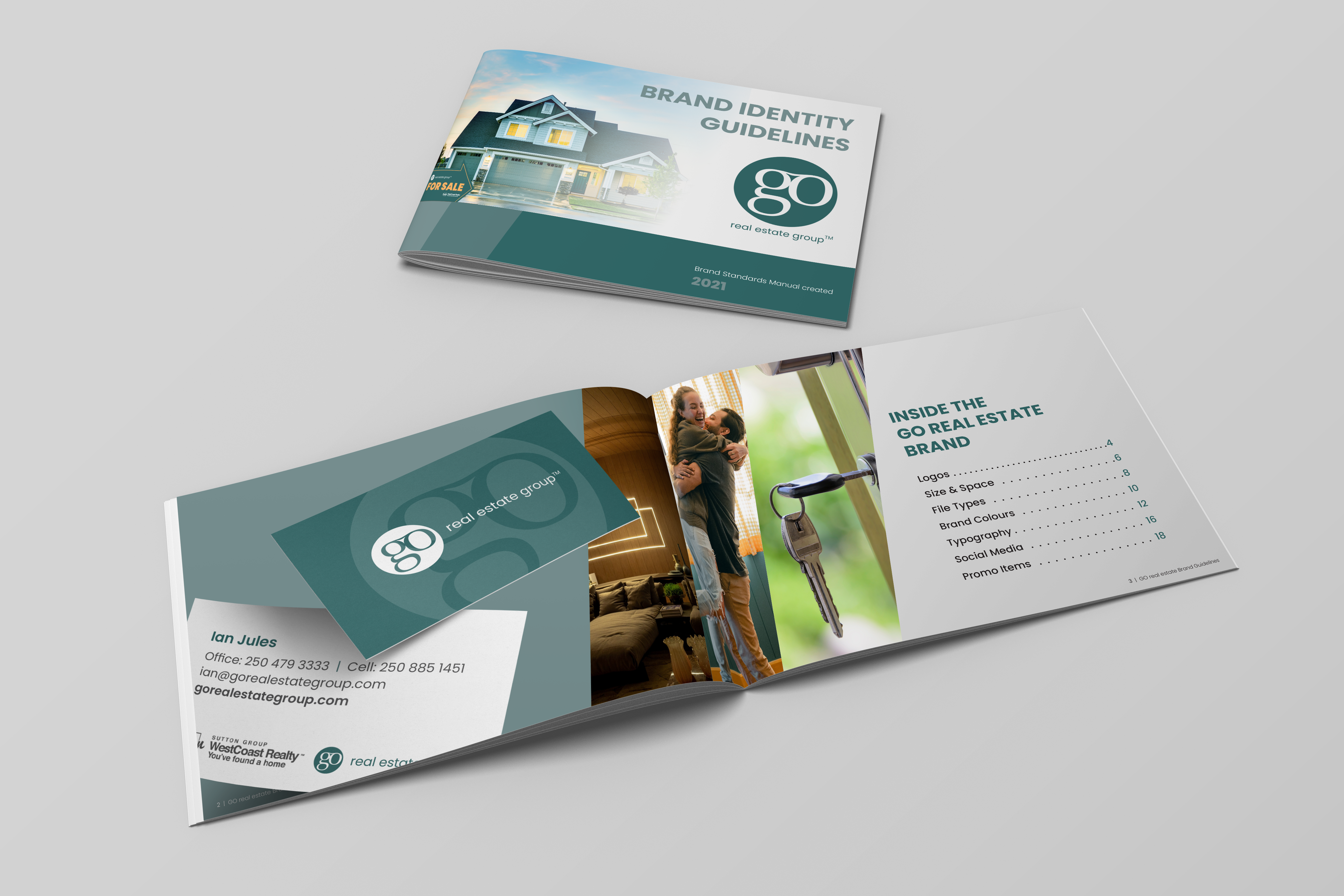
Go Real Estate
I created the Go Real Estate logo as well as a number of brand assets including business cards, style-guide, and signage.