
Strategic Use of Color Blocking I use colour intentionally to create structure and make information easier to navigate. In this report, the bold color blocks help anchor each section and add energy without distracting from the content. They guide the eye naturally, making the layout feel organized and confident. Clear, Modern Data
Sasquatch Home Services
For Sasquatch Home Services, I created a brand identity rooted in local character and environmental values. The logo and visual system capture a balance of “home comfort plus respect for nature,” helping the company position itself as friendly, trustworthy, and community-minded. By using a mascot-style logo and nature-inspired graphics rather than a typical “sterile

Office of the Chief Investigations Officer, Nunavut
This is a 60‑page annual report designed for print and web, featuring a well-structured layout integrating text, images, tables and charts. The design delivers clarity and professionalism across complex content, ensuring the report is visually balanced and readable while supporting accessibility for diverse audiences.
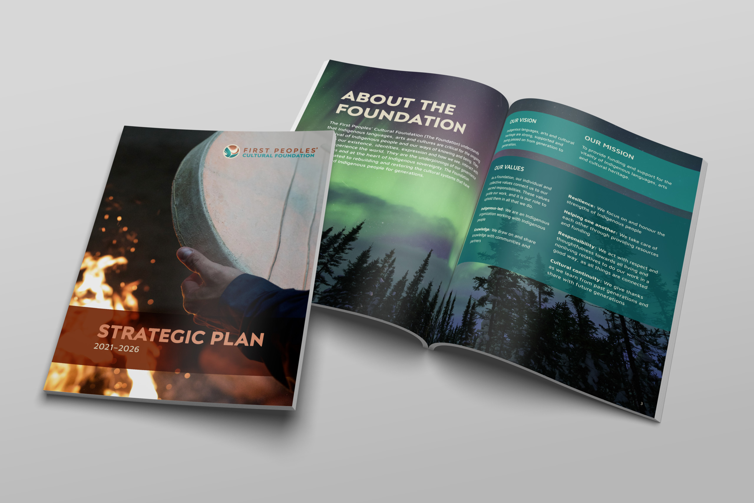
The First Peoples’ Cultural Foundation
Print layout document design for the First Peoples' Cultural Foundation's Strategic Plan
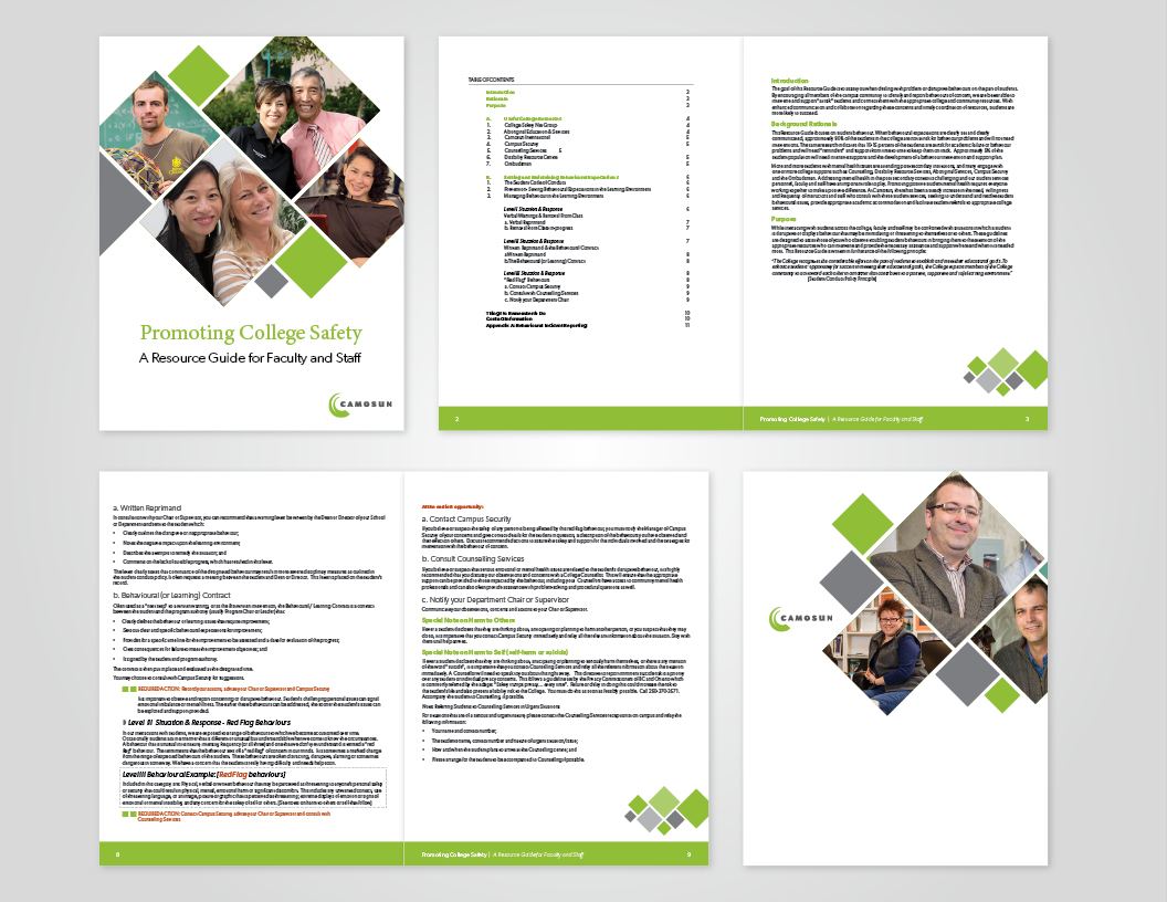
Camosun College
Client: Camosun College The Project: design and layout of the Health & Safety Guide