The Nourish + Flourish logo has a warm, inviting, and uplifting feel, built around a combination of elegant typography and soft, nature-inspired visuals. Typography The word “Nourish” is set in a soft, muted green serif font. It feels calm, grounded, and nurturing. The word “Flourish” uses a contrasting script font in a warm coral-red color.
Sasquatch Home Services
How the Logo Supports Sasquatch's Branding Strategy Brand Meaning: The logo reinforces their brand promise — “home comfort + respect for nature.” Their messaging emphasizes environmental consciousness (e.g., planting trees for every heat pump installed) and community roots. Emotional Connection: For many customers in Vancouver Island / BC, the Sasquatch evokes local culture, outdoors,
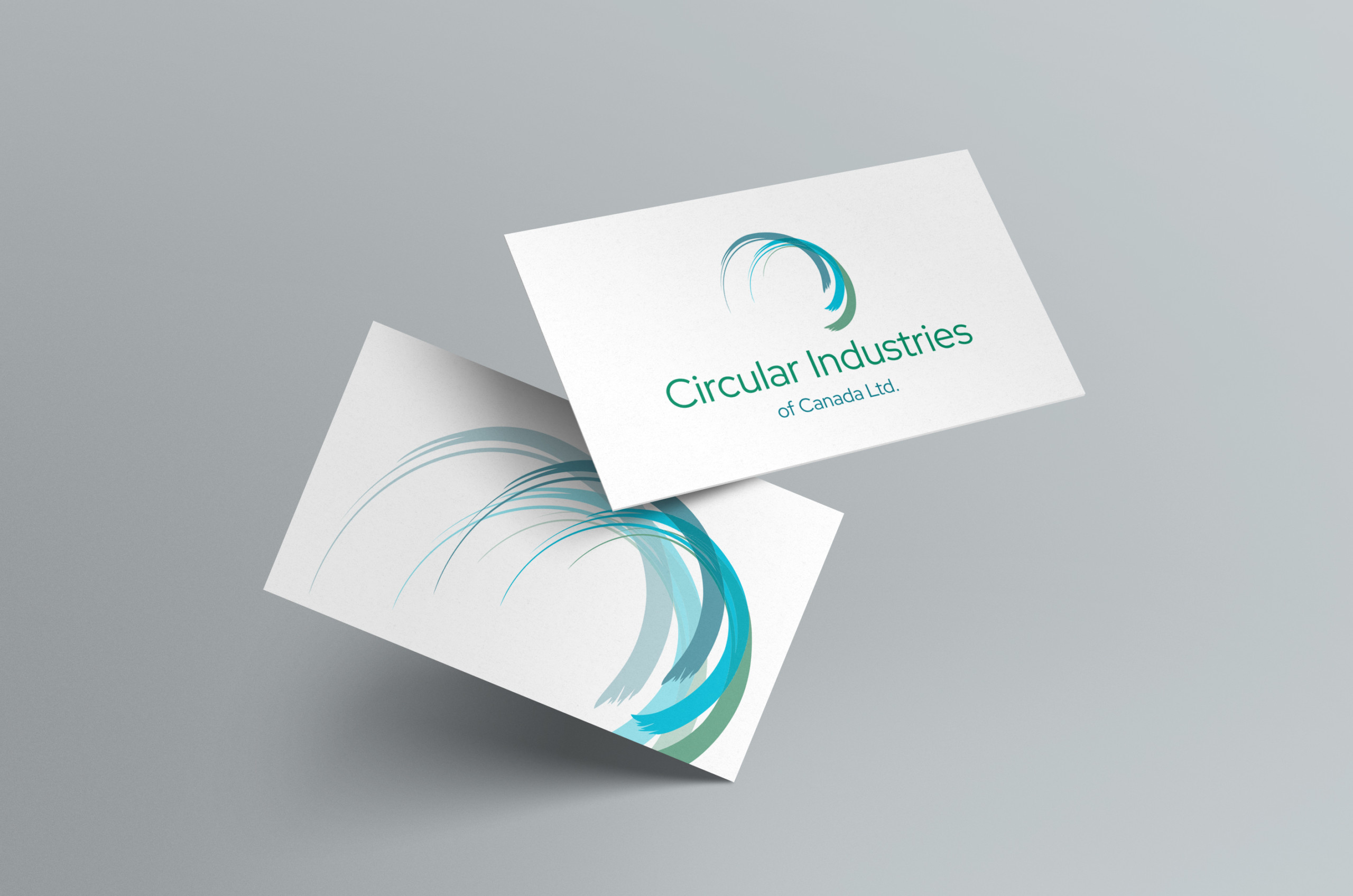
Circular Industries
Logo and branding for sustainable energy organization, Circular Industries
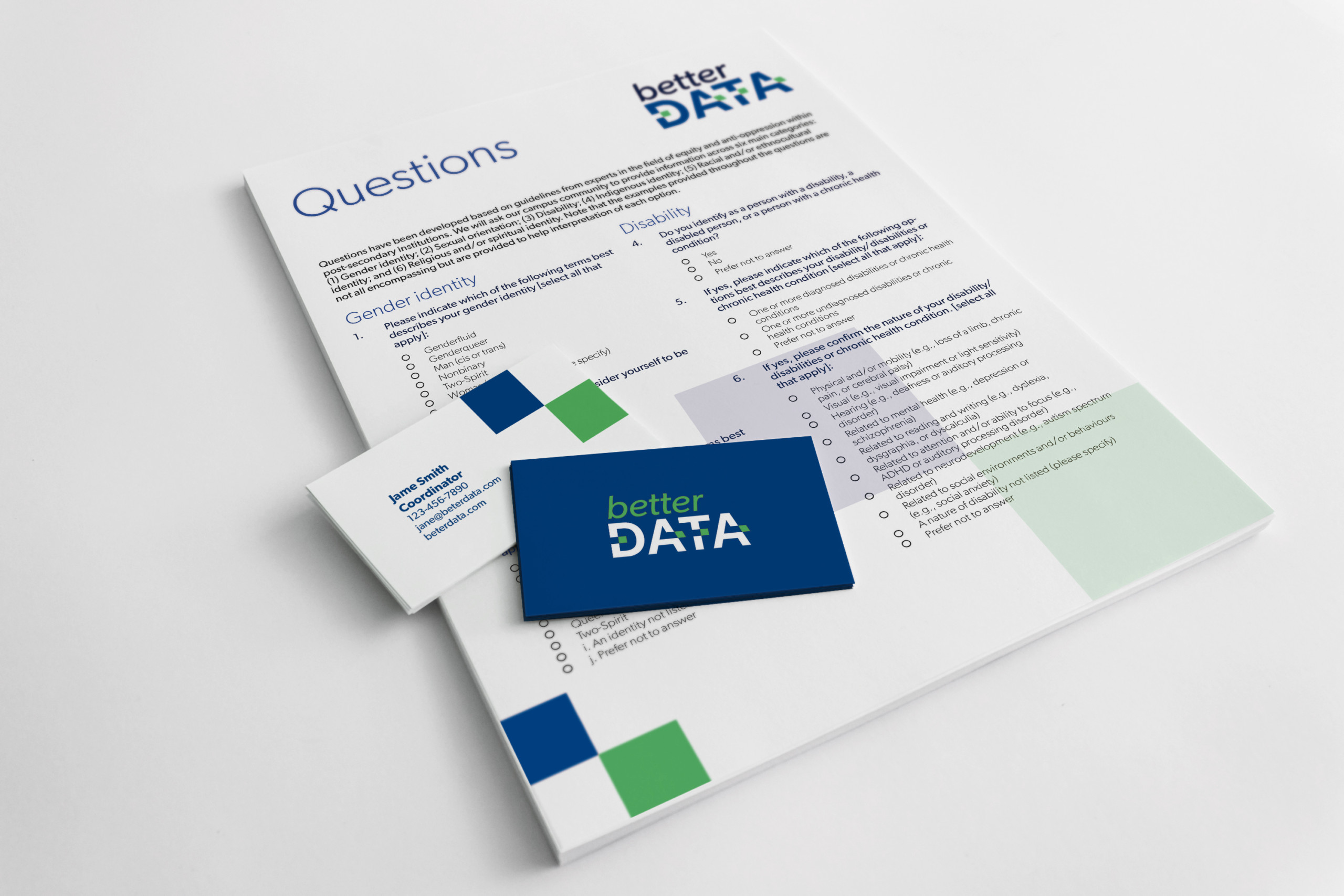
UVic – Equity Management
Logo and branding for for Uvic's Equity Management initiative, Better Data.

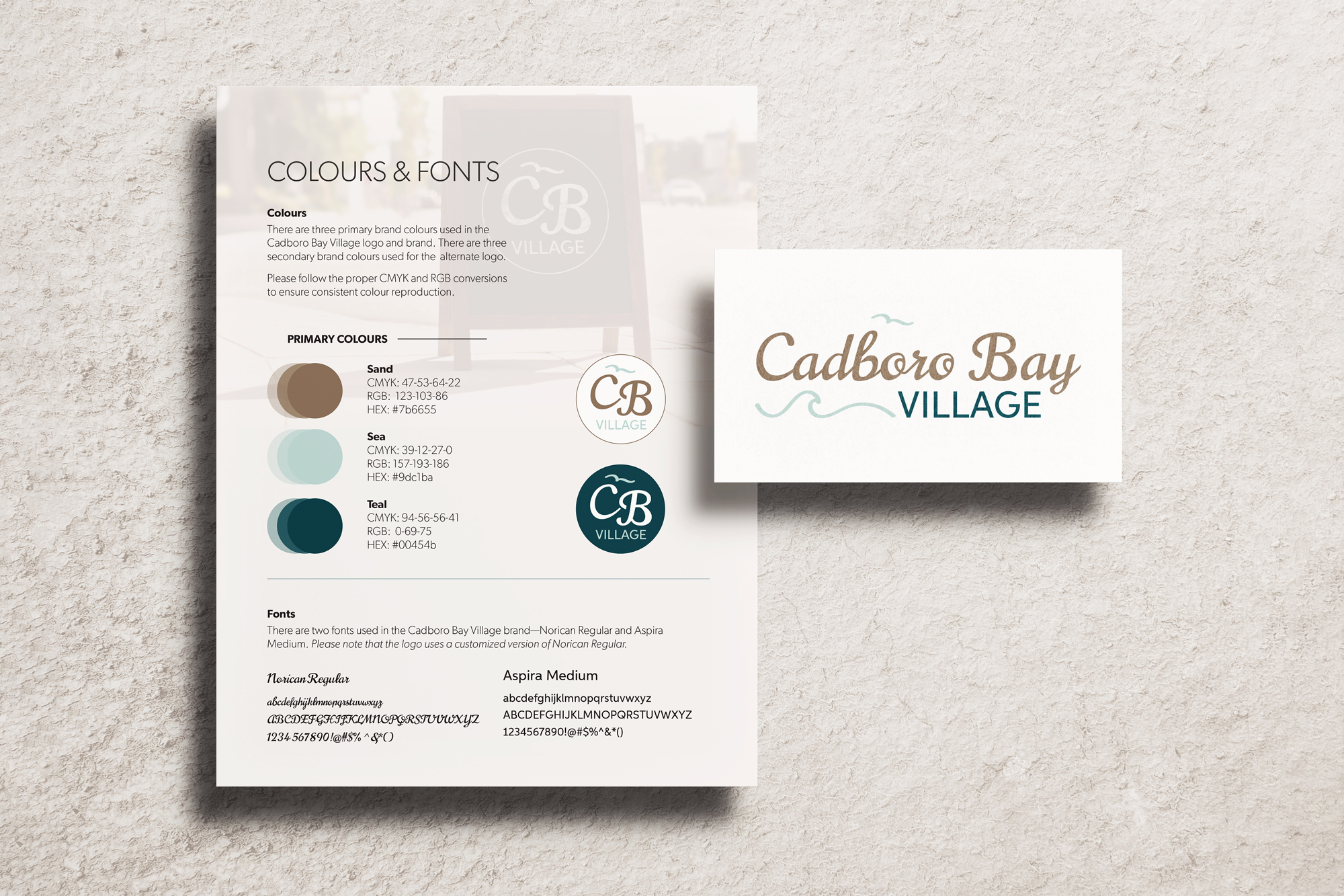
Cadboro Bay Village
From conception to completion, the new Cadboro Bay brand mark is sleek and beautiful, yet still pays homage to the original logo.
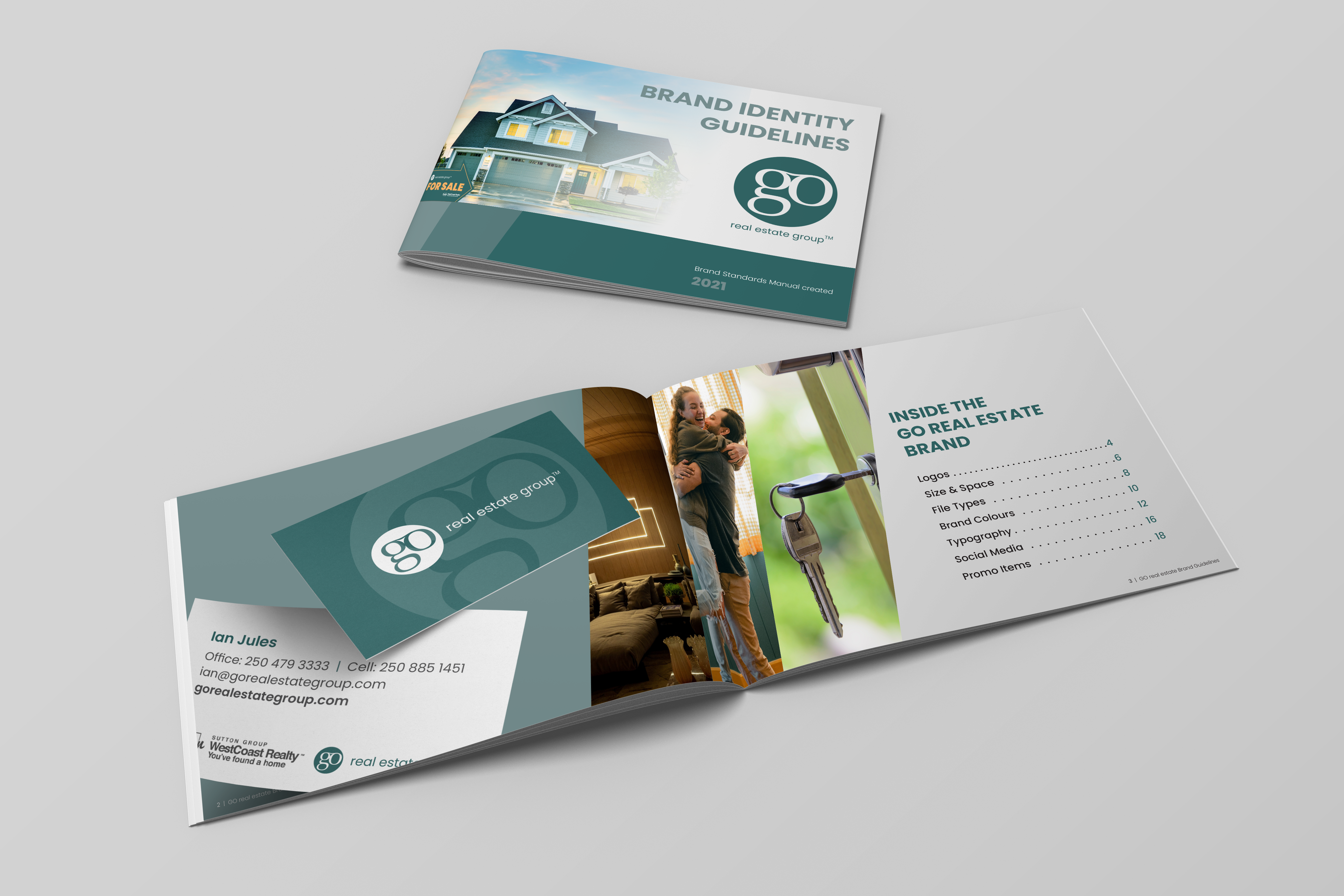
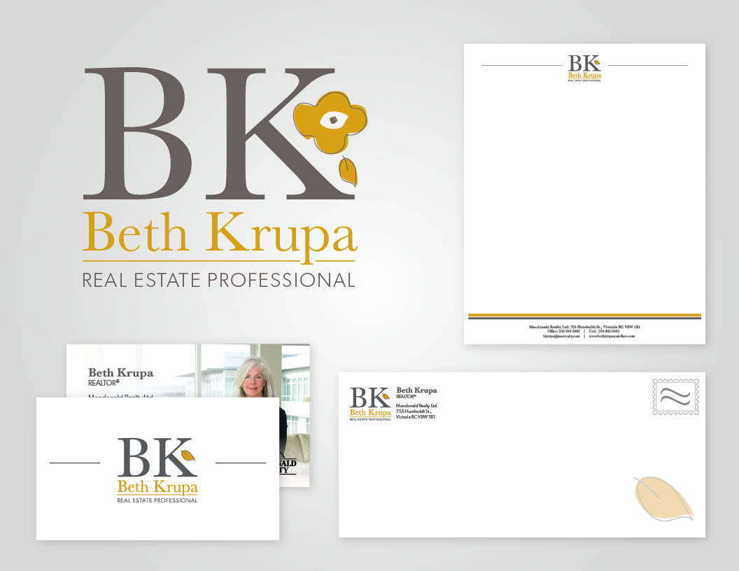
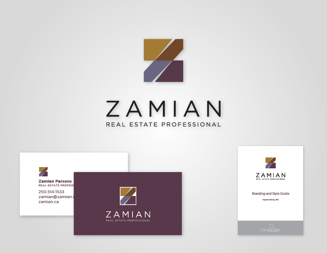
Go Real Estate
I created the Go Real Estate logo as well as a number of brand assets including business cards, style-guide, and signage.