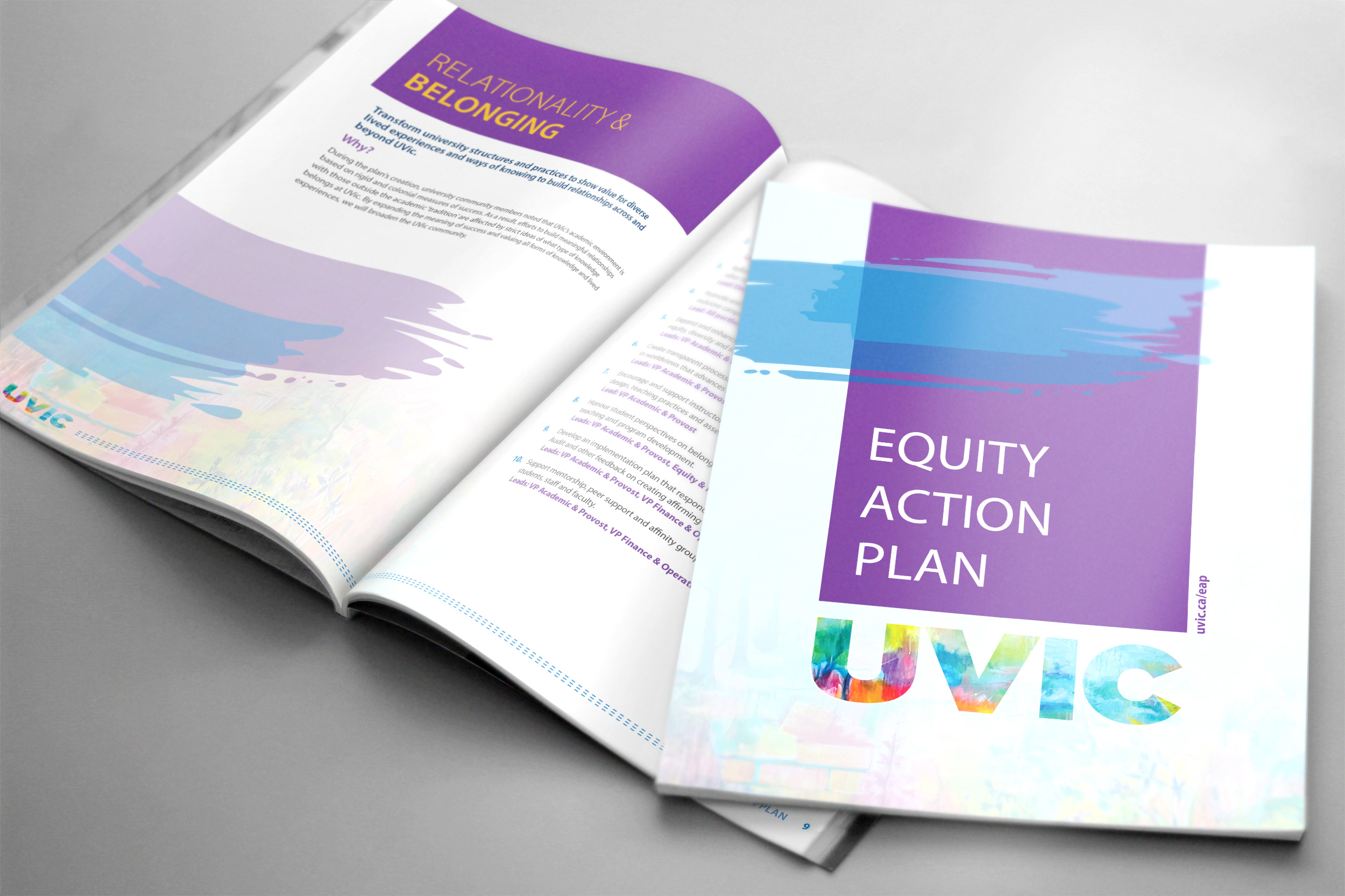
This document design for the University of Victoria's Equity Action Plan was intended to be clean, modern, and visually expressive, using bold colour fields, artistic textures, and structured typography to communicate clarity and importance while maintaining an engaging, approachable feel. I was asked to make this: Professional yet expressive Institutional but not rigid Inclusive,
UVIC – Nourish + Flourish
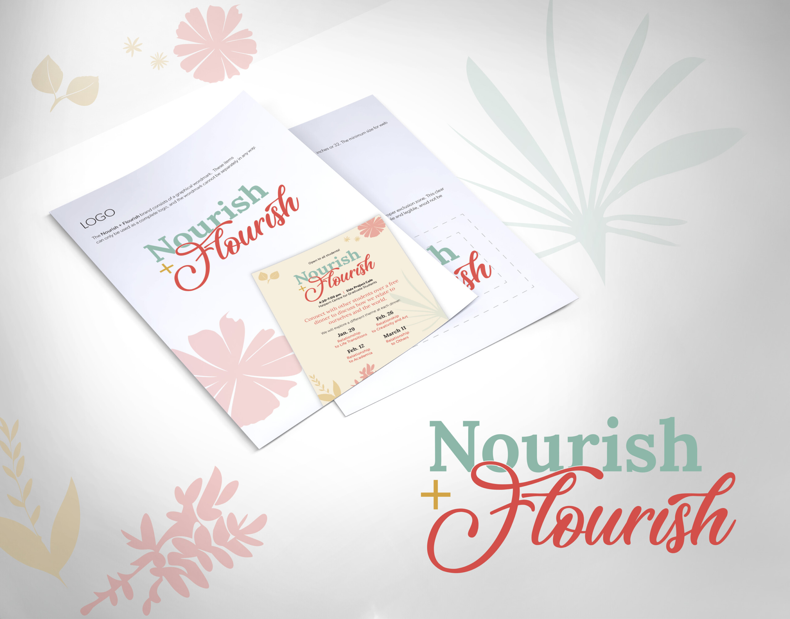
The Nourish + Flourish logo has a warm, inviting, and uplifting feel, built around a combination of elegant typography and soft, nature-inspired visuals. Typography The word “Nourish” is set in a soft, muted green serif font. It feels calm, grounded, and nurturing. The word “Flourish” uses a contrasting script font in a warm coral-red color.
