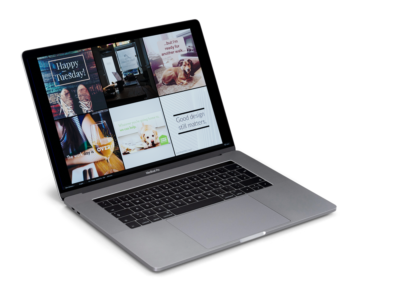
 I love creating beautiful designs for my clients, but sometimes it just makes sense to design certain content on your own. One of my jobs is to help my clients determine if the project they have requires professional design services or not. Leaving things like logo design and website design up to professionals is pretty crucial, but being self-sufficient enough to create your own social media posts, for instance, is often a good way to keep your design costs down!
Here are a few quick design tips and tricks that we provide our clients so that you can make your own content look good.
Quality of Imagery
The easiest way to make your content look bad is by using poor-quality imagery. The quality of a perfectly good design can be instantly undermined by using images that are of low-resolution/pixelated or blurry. Generally, a good rule of thumb is to ensure any images or logos you’re using in your design are at least 1MB in size (or 500KB for a logo, as they tend to be less complex files.) This is especially important when creating content that your audience will be viewing on a device that has retina display, which, if we’re being honest, is now most of them!
Typography
When selecting a typeface or font for headings, subtitles and body text, use easy to read fonts for simple and effective graphic design. The eye finds it hard to scan multiple typefaces, so stick to a simple collection of fonts. Our rule of thumb is to never use more than two fonts. We also caution our clients against displaying more than a few words at a time in All Caps, and being very picky about using a handwritten font sparingly.
Colour Scheme
Choose a colour scheme that has one to three colours that contrast and complement each other nicely. You can use different tones of the same colour for consistency by adjusting brightness for contrast, but don’t forget to always include your brand colour(s) so that you continue to build brand security and loyalty though-out all of your print and digital material.
Don’t Crowd Your Design
Let your design elements breathe by giving them lots of white space. The more items you crowd into a design, the less professional that design will look. Compare a high-end clothing store to a department store, and think about which exudes quality, and which doesn’t. Less is almost always more, and your design will really stand out if you lessen the amount of content per graphic.
The Takeaway.
Ultimately it is up to you how much of your own design work you want to take on. I am always here to support my clients with all of your design needs, from small project to big.
Leave A Comment