Project Description
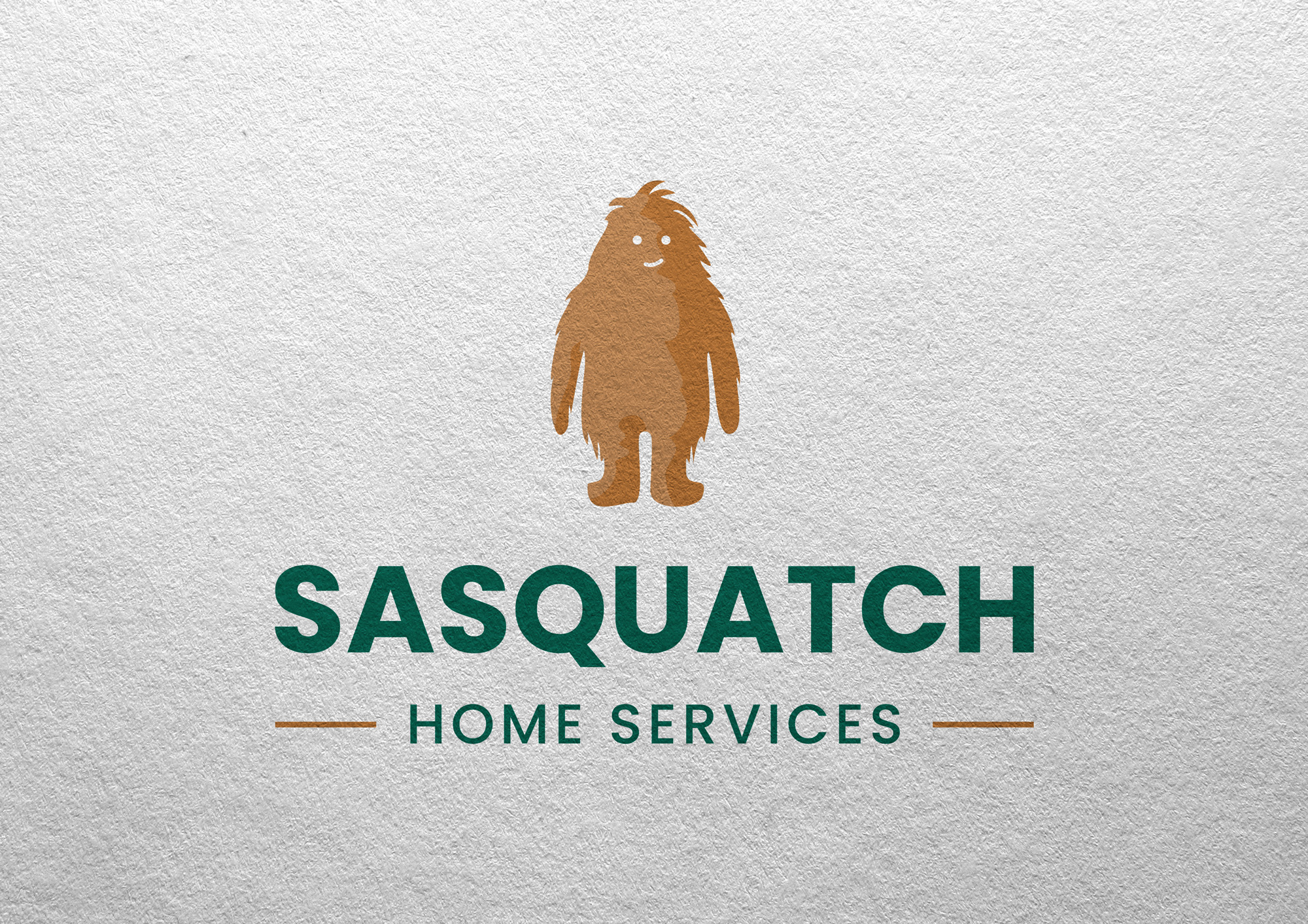
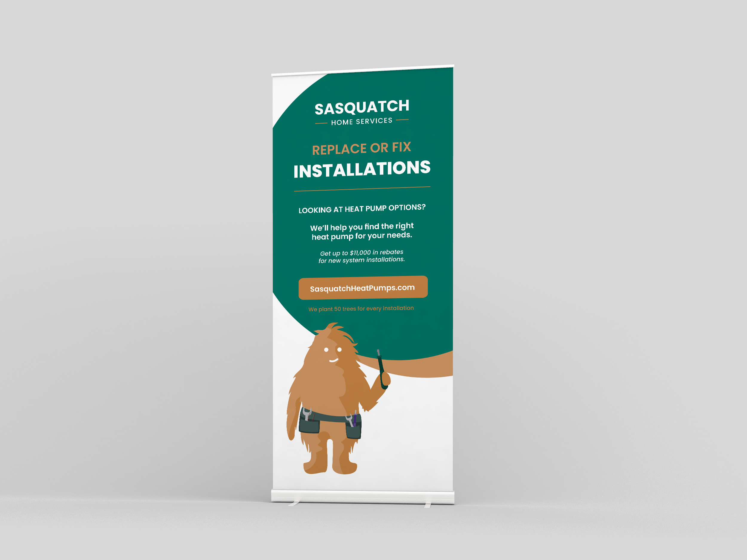
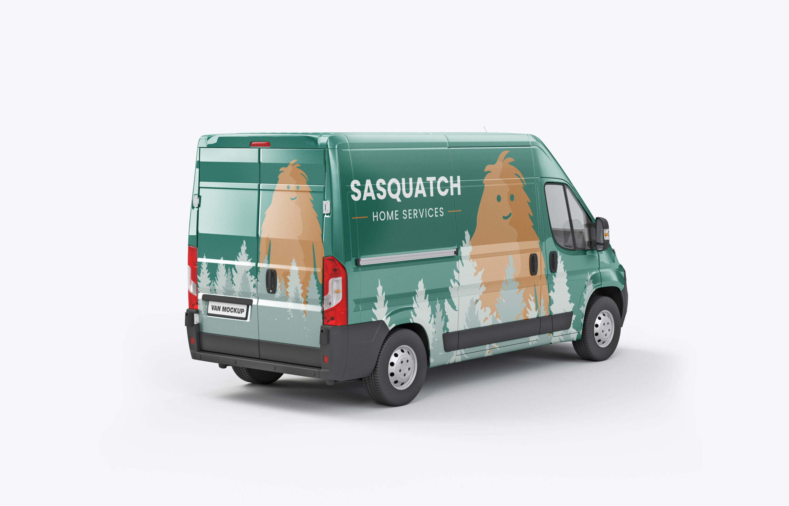
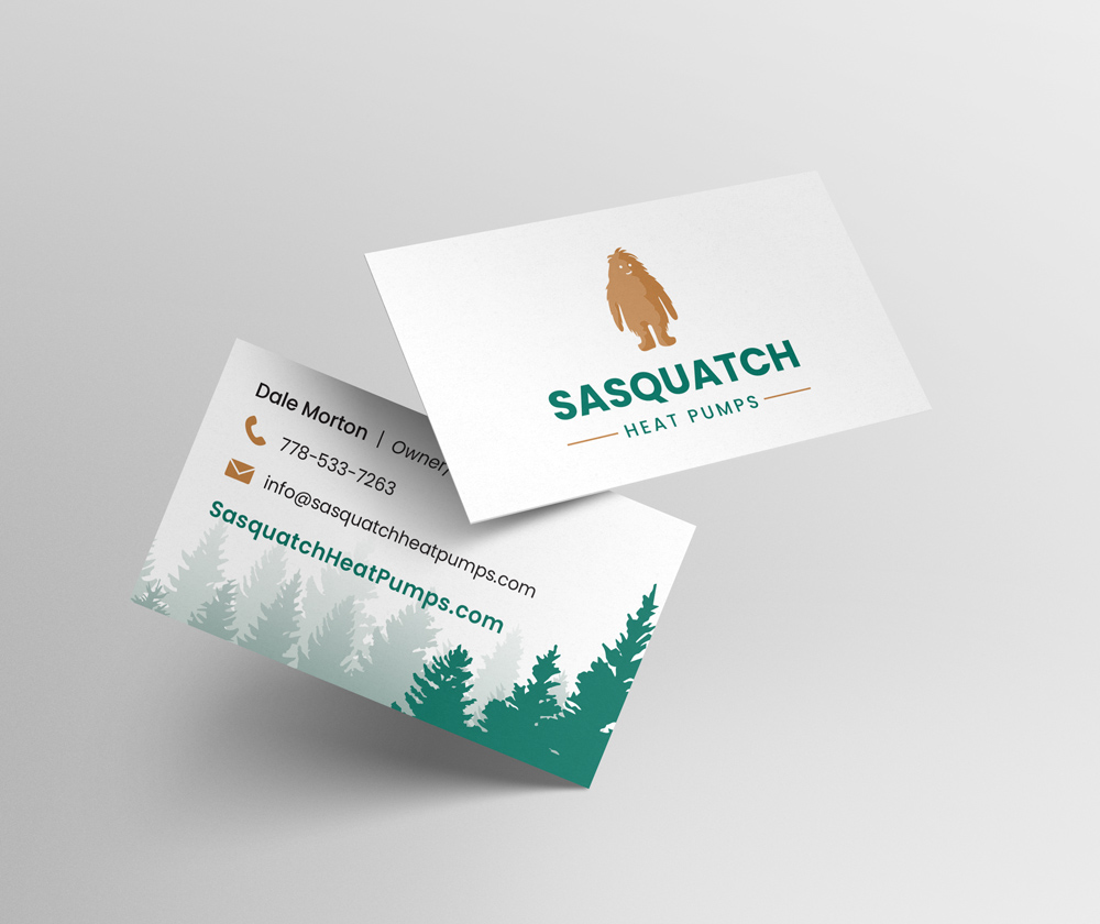
For Sasquatch Home Services, I created a brand identity rooted in local character and environmental values. The logo and visual system capture a balance of “home comfort plus respect for nature,” helping the company position itself as friendly, trustworthy, and community-minded. By using a mascot-style logo and nature-inspired graphics rather than a typical “sterile HVAC” look, the identity connects emotionally with customers on Vancouver Island and across BC, evoking warmth, reliability, and a sense of local belonging. The design is flexible and scalable and works across website, social media, business van graphics, print flyers, and more, ensuring consistent branding across all touchpoints.
How the Logo Supports Sasquatch’s Branding Strategy
-
Brand Meaning: The logo reinforces their brand promise, “home comfort + respect for nature.” Their messaging emphasizes environmental consciousness (e.g., planting trees for every heat pump installed) and community roots.
-
Emotional Connection: For many customers in Vancouver Island / BC, the Sasquatch evokes local culture, outdoors, and reliability. That builds affinity beyond just a transactional service relationship.
-
Differentiation: In a competitive home services / HVAC market, most companies go for sterile or purely technical logos. By using a mascot + natural-inspired branding, Sasquatch stands out as more human, friendly, and locally grounded.
-
Flexibility: As mentioned, the logo is simple enough to scale and apply to different uses such as website, social media, vans, print flyers, etc. This helps maintain a consistent brand identity across all touchpoints.
