Quite often I get asked what the difference is between a logo and a brand. This is not a stupid question, but the answer is actually pretty simple. A brand is the feeling a person gets about your product, service, or organization. It is so much more than just the logo on your business card.
![]()
A good logo is an important brand asset and a way to help differentiate you from your competition. It will communicate the essence of your brand to the market. Your logo (also known as a mark, brand mark, trademark, wordmark, logotype, symbol, or brand icon) is only a small (albeit important) part of your brand. It is the graphical element that spearheads your brand. If you think of your brand as a ship, your logo is the mermaid that basks at the front of it, and your brand is the ship itself. The mermaid is what is seen first, but ultimately, the ship carries what is really important.
Often, when a brand is being created, the logo is the first thing to actually be designed, and the other elements follow suit. However, branding should be considered throughout the entire process because a logo cannot stand on it’s own without a brand to back it up. All of those other elements, every single one of them, are part of the brand, too. They can include a website, a business card, letterhead, advertising, and anything else your customers will see.
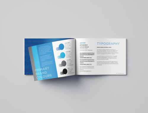
When a brand is being designed, there are some choices that need to be made so that down the road, everything that is created can be done so within the parameters of the brand. They include things like a primary and secondary colour scheme. Perhaps your logo is green and gold, but you want your advertising material to include brown and grey as well, so that you aren’t limited to only two colours. The green and gold would be your primary colours, and the brown and grey your secondary. A good designer will choose these colours carefully so that they look good together. Your brand guide would then specify that the brown and grey are only to be used when the green and gold are present, and not on their own.
Consistent font choices are also very important. Generally a strong brand should include two fonts, with at least one of them having a large family. A font family is when one particular font comes in many different weights, such as thin, regular, semi-bold and bold. Each weight should have an italicized version. A good example of a font with a large font family, is Helvetica. Your brand guide should specify which font to use as a header, and which to use for body text. There are times when your company will create a document where certain pieces of text need to stand out, and that is when having a large font family really comes in handy.
These chosen fonts and colours appear in the logo, but will also be used throughout all of the marketing material so that when a customer looks at a business card, a website or an advertisement, they instantly recognize the company. A designer who has a lot of experience in branding will understand that there is a “look and feel” that needs to be created using the logo, colours, fonts and design style. That style becomes a key part of your brand. Your customer will recognize your brand before they even understand why they’re recognizing it. And that is the beauty of branding.


Leave A Comment