
Colour space. What does it mean and why do designers care?
Being an expert on colour space is the job of any designer who wants to be successful. That’s because different mediums require different types of colour, and using the wrong one can have disastrous effects.
It may not occur to you, but your computer screen is emitting colour as light, while the magazine you’re staring at, is inked paper absorbing or reflecting specific wavelengths. Light and ink see colour in different spaces. RGB (red, green, blue) is additive, which means that if you combine the maximum of all three, you get white. CMYK (cyan, magenta, yellow, black) is subtractive, meaning that when you combine the maximum of all four (or just CM and Y), you get black.
Computer monitors emit colour as RGB light. Although all colours of the visible spectrum can be produced by merging red, green and blue light, monitors are capable of displaying only a limited range of the visible spectrum. In other words, the human eye is capable of seeing more colours than a computer monitor. When graphic designers start a project, we design in the RGB colour space because we’re using a computer and we want to see our colour choices as accurately as possible.
Although a computer monitor only emits colour in RGB, it is capable of converting colours into an accurate depiction of CMYK so that we can see a sample of what our work might look like when it is printed. CMYK pigments serve as filters, subtracting varying degrees of red, green and blue from white light to produce a selective range of spectral colours. This sounds complicated, but the good news is, we don’t have to fully understand how it works in order to create successful design. Have you ever changed the cartridge in your at-home printer and noticed four little coloured dots on the side of it? Those dots depict a swatch of one of cyan, magenta, yellow or black, which are the four ink colours a printer uses to create every variation capable in the CMYK range.
So when a designer is creating a website or online advertisement, we use the RGB colour space because the file is only going to be viewed with a monitor, whether computer, smartphone or ipad.
However, if we’re creating a magazine layout, poster, flyer, banner or any other number of printed materials, we convert our files to the CMYK colour space before we send them to print. This can be as simple a process as choosing the convert option in photoshop, but it can also get a bit tricky.
If a file is meant for print, a graphic designer knows that some of the colours available in the RGB spectrum are not printable in CMYK. This includes very bright colours, especially reds and oranges. Therefor, we have to keep this in mind while sending digital proofs to clients. CMYK tends to look dull on a computer screen compared to RGB, and that’s because white paper is not as brilliant as the white light emitting from your screen.
In the world of print design, we also use a term called Spot colour. When sending a file to print in CMYK, the printer mixes various quantities of the four inks to create certain colours, and this leaves room for unwanted colour variation, especially if you are using different printers. A printer prints mainly in one of two ways. Either the machine mixes the inks internally before laying them onto a page (digital) or the machine lays down different plates of CMYK, layering them for the same effect (offset).
Spot colours refer to a predetermined mixture of ink that is inserted into the machine, or placed onto an individual plate to create the same colour every time. Confusing? Think of it this way:
If you go to a store looking for wall paint, the guy behind the counter will mix the paint colours for you using a machine, and hand you a pail of the exact colour you asked for. If he handed you a pail each of cyan, magenta, yellow and black, and told you to measure it and mix it yourself, there would be a lot of room for error.
A company called Pantone has cornered the spot colour market. Pantone has created a number of spot inks that are used as an industry standard for designers and printers across North America. Some of Pantone’s ink shades are actually outside of the CMYK colour spectrum, which makes them very useful. The best part is, Adobe has integrated the Pantone library right into it’s programs, so essentially, a designer can create something using just Pantone colours. Pantone colours come in handy when designing logos, because they will be used in both print and on the web, and the Pantone swatches can be converted to both CMYK and RGB.
Knowing the difference between CMYK and RGB is very important in the world of graphic design, where we are constantly comparing, assessing and critiquing colour. Choosing colours that make a company stand out against their competition, and having those colours reproduce precisely every time and across every form of media is something a graphic designer spends a lot of time meticulously planning out.
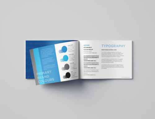
I provide colour guides to all of my clients, so that they can understand and reproduce their own colours, whether it’s on the web or in print.


Leave A Comment